
By Shahan Shahid Nawaz, Data Fellow
Data visualization as a practice is gaining the repute “data science” commanded a few years ago: an ever-rising amount of data requires an ever-rising investment in sensemaking too. In drawing signals from the noise, approaches like machine learning and data visualization hold great power. In machine learning’s case, the complexity of the data can be reduced, or patterns found automatically whereas data visualization taps into our highly developed visual ability to simplify data and convey meaning.
Luckily, as opposed to machine learning, which can require a multi-year effort of developing skills and collecting suitable data, your organization can get better at pulling insights from data with visualization very quickly.
This summer, I had the opportunity to work as Breakwater Strategy’s inaugural Data and Communication Strategy Fellow. Currently a master’s student at UC Berkeley’s School of Information, I studied visualization from Prof. Marti Hearst, a leading practitioner and thinker of information visualization. I found her class illuminating: it taught me the importance of drawing visualization inspiration from different sources, and of careful, deliberate thinking when visualizing data.
At Breakwater Strategy, I used the Fellowship to grow the conversation surrounding data visualization and about its role in making sense of data. One of the ways this drive manifested itself was ‘Data Viz Happy Hours’ where staff discussed and drew inspiration from best-in-class data visualizations handpicked by me.
These conversations and my work during the summer helped me see even more clearly that inspiration and deliberate iteration play a leading role in sharpening one’s ability to visualize data effectively. This article is a quick introduction to the world of data storytelling and offers recommendations for creating visualizations that have the power to simplify complicated datasets and spur decisions.
I present and elaborate upon visualizations we discussed over the summer in Part I. In Part II, I share recommendations for producing effective visualizations.
Part I: Drawing inspiration from best-in-class visualizations
- Implement “Less is More” to Improve Common Charts | Tables; Pies; Bar Charts; Maps (Source: Darkhorse Analytics)
These redesigns “show” the process of creating a compelling visual in Microsoft Excel, a surprisingly effective and popular tool for data visualization though one which—given its abundance of defaults—also makes it easy to err by incorporating confusing elements and designs (e.g., 3D plots). The results are aesthetically pleasing because information redundancy is minimized while the stories in the data are not just surfaced but made simpler for the reader to understand. In addition, these quick GIFs are packed with data visualization concepts such as the careful use of color (as in the Maps Edition where the rainbow misrepresents the underlying distribution of the data), and removing vertical lines from tables–sometimes the most effective visual–to avoid obstructions as a reader scans the data from left to right.
- Use Color to Tell Stories at a Glance | Where are Americans Born? (Source: Law Office of James A. Welcome / 1Point21 Interactive)
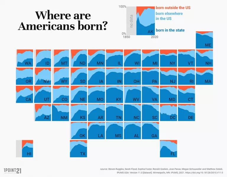
The graph at the center of this story is packed with visualization best practices: color is used effectively such that a large amount of information is readable and US states are comparable without overwhelming the reader. Additionally, the US map is presented as as a grid, sidestepping the problem that “maps of the U.S. for whatever variable in effect show population density more than anything else” [Source]; and finally, a story is told: since 1850, most Americans have been born in America though this is more true in some states than others.
- Make Art Out of Data Viz | Warming Stripes(Source: Institute for Environmental Analytics, University of Reading)

At its surface, University of Reading’s #ShowYourStripes is just a set of colored vertical bars–122 to be precise for the years 1901-2021, each representing the average temperature recorded in a year–stacked next to each other. But, their warming colors tell the story of climate change so vividly that this visual not only went viral online upon release, but has also spurred merchandise (even though that may be counterintuitive to the visualization’s implicit goal of inspiring climate-related action). This visualization, and its minimalism, also blurs the line between art and data visualization without compromises in either–that’s a rare feat and therefore a great visual to draw inspiration from!
- Show Patterns through Interactivity | Windy.com (Source: Windy)
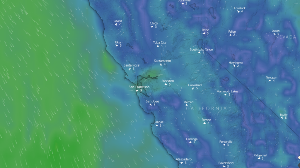
Weather, as Nate Silver writes in Signal and the Noise, is an area of study and prediction that has benefited immensely with growing computing power and data robustness. This interactive website shows, through animation, predicted weather trajectories overlaid on a map. It is particularly illustrative for wind and rain patterns and storms. Though it takes some mental calculus to determine how likely it is to rain in the next hour in your location, its win is in making information such as cloud movements easily accessible and thus giving readers a level of insight not available otherwise.
- Choose the Best Chart for the Job | The Impact of Vaccines (Source: The Wall Street Journal)
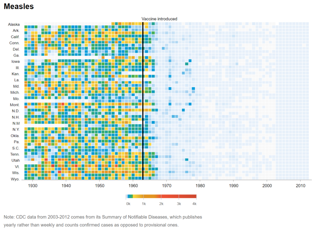
It is one thing to say that vaccines work but quite another to visualize this fact in a compelling way. Wall Street Journal’s effort, at its surface a simple color-coded temporal dot chart, achieves this effect with stunning clarity. A clearly labeled line denotes the introduction of a vaccine and changes in color–from red to greens and blues–indicating declines in infections with great power and dramatic effect. This presentation also surfaces inherent challenges in vaccine uptake: the mere introduction of a vaccine, as in the chart from Rubella, does not eradicate the infection but instead kicks off a “lagged effect” and cuts the infection’s transmissibility which in turn cuts infections further. This added nuance is less visible (if not lost altogether) in alternative, non-temporal visualizations such as the percentage or total population of individuals vaccinated.
- Visualize Uncertainty as Odds | FiveThirtyEight’s 2020 Election Forecast (Source: FiveThirtyEight)
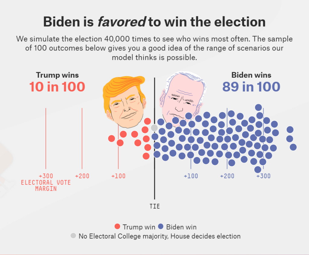
Uncertainty is challenging to convey visually and recent research [1, 2] suggests that approaches used commonly such as error bars can confuse rather than clarify. FiveThirtyEight presents an interesting solution: instead of stating a certain predicted truth, for example, a 65% chance for Joe Biden to win the 2020 election, they publish and visualize odds. This is an evolution in FiveThirtyEight’s approach to visualizing uncertainty. Their 2016 election forecast predicted a 28.6% chance of Donald Trump’s winning which spurred confusion and accusations of making a “bad” prediction when Trump ultimately won.
The 2020 version’s homepage, instead, visualizes a handful of potential election outcomes to show that each of these outcomes is possible even though more potential outcomes favor Joe Biden. Further in the article, too, the same message is driven home in a dot chart where a line separates the two candidates–there certainly exist outcomes to the left of the line–cases where Donald Trump wins–but we can see that these are outnumbered by the potential outcomes favoring Joe Biden.
- Visualize Uncertainty by Showing Predictions Against Reality | COVID-19 Forecast Hub (Source: Reich Lab of the University of Massachusetts Amherst)
Continuing with the theme of uncertainty, this aggregation of different COVID-19 predictions not only highlights the challenges in forecasting but also shows how varied our perceptions of the future can be from our moment in the present. The other unique aspect of this visual is their COVID hub-ensemble, an aggregate prediction based on all other COVID-19 forecasters, showing us that oftentimes the visuals we produce from the data–and the simplicity we strive for–are a product of the way we analyze, wrangle, and cut the data. The visualization’s title, too, is notable for its clarity and aids the reader as they browse through the predictions. That title is reproduced as follows without comment: “Most forecasts have failed to reliably predict rapid changes in the trends of reported cases and hospitalizations. Due to this limitation, they should not be relied upon for decisions about the possibility or timing of rapid changes in trends.”
Part II: Excelling at telling stories with data
After exploring how other individuals and organizations are able to develop compelling visualizations, the next step is considering lessons we can glean from these executions, and applying those concepts to our own work. This section outlines a few key recommendations and ideas for crafting effective visualizations that draw on these examples.
- Realize the difference between graphing and storytelling
Plotting any piece of data, for example sales over time across different retail units as a line chart, ensures mathematical accuracy by definition. But, presenting such a plot without a story leaves the reader to draw their own insight. Storytelling with visualizations can make the reader’s life easier and enable them to do more with the data.
Data visualization has a lot to learn from traditional storytelling. Good stories disclose information progressively without overwhelming the reader, highlight important details, and,the best ones, use carefully selected vocabulary. These concepts apply directly to data visualization. Let’s take an example:
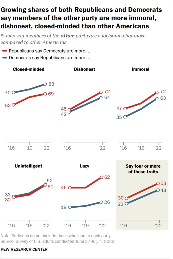
This plot from the Pew Research Center uses a title to guide the reader through the visual and defines the story. Subtitles too–though used here to define how this data was measured instead of furthering the story–offer another space for additional storytelling. Notice the labels as well. A viewer, scanning naturally from top to bottom and left to right, can follow the label to read the story as: “Republicans say Democrats are more close-minded” and then track the percentage plotted in the line chart to “read” each datapoint as a story.
Visualizations can also tell stories if data are highlighted or called out using text to focus the reader’s attention. The aforementioned 2020 election forecast from FiveThirtyEight implements these narrative elements and couples them with design choices, such as a tie line in the middle and a diverging horizontal scale that pits the two candidates visually, to produce a neat, compelling story.
- Calculate, and minimize, the number of datapoints being presented in a chart
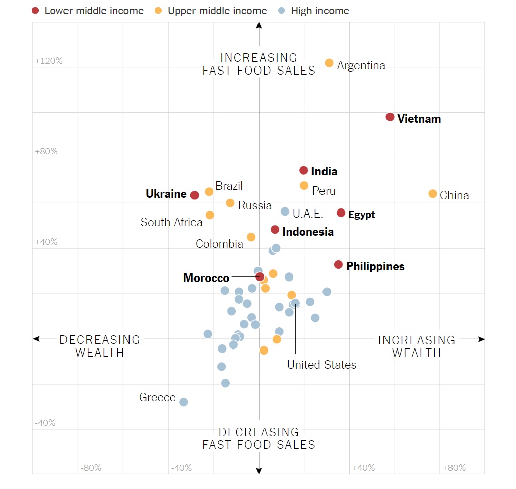
Simplicity can be achieved in data visualization by counting the number of dimensions presented to the reader and ensuring this number is kept to a minimum. For example, in the following scatter plot, each country is positioned by Increasing Wealth (1st variable), Increasing Fast Food Sales (2nd variable) while colors encode each country’s income status (3rd variable)1. Three variables for each observation, a myriad of colors, and two axes make this a “busy” chart, and could confuse even a sophisticated reader.
This general recommendation also applies to charts with dual axes. As in the example below, each point represents one of the two data series being plotted and the year of the observation, while colors reinforce the existence of two series. This too, as the image’s source explains with excellent detail and presents solutions for, leads to a busy chart that can be simplified.

University of Reading’s Warming Stripes, mentioned above, strike a beautiful balance between the number of dimensions visualized (two; temperature and time) and simplicity.
- Deliberate over all choices and avoid defaults
As touched upon in the discussion surrounding The Wall Street Journal’s “The Impact of Vaccines”, visualization benefits immensely from deliberate, thoughtful decision making and choosing the right chart for the job. Just because your tool of choice, say Microsoft Excel, defaults to a certain chart type or looks a certain way does not mean that choice has to be accepted.
As opposed to a rule-based approach to visualization (e.g., “pie charts never work”), being able to justify choices is paramount. In the process of visualizing data, there are numerous decisions including whether to show the axes, whether to align the title to the center, which color to use, and whether to label data points, to name a few. Careful consideration is key to producing visualizations that are more likely to work compared to those produced by software defaults.
- Involve more perspectives in the process
Visualization is a design discipline, and choices are often subjective. Given human visual ability and its evolution, we are more adapted to see comparisons presented in some ways compared to others. For instance, we are attuned to pattern matching, filling in negative space, grouping objects that are in proximity to each other, etc.2 Beyond some of these core principles, all opinions about a visualization are valid and useful. Soliciting opinions from a high number or diverse set of individuals can help determine if the visualizations are conveying the meaning and stories as intended. Hearing feedback from others can help data visualizers improve those that are not.
- Keep an eye on research and what works
Data visualization is a surprisingly well-researched discipline. Researchers have studied, for example, how and whether error bars successfully convey uncertainty (hint: they don’t), how much time it takes the eye to scan a bar chart as opposed to a line chart, and how effectively one can recall/retain the information when presented with different chart types. Recent research, such as Franconeri et al (pg. 115), catalogs what works and does not. Appreciating research, then, can guide visualization decisions and help avoid common pitfalls.
- Use color effectively
Color is the centerpiece of data visualization. It carries the dual burden of presenting the data but also of ensuring aesthetic, beauty, and gravitas. Charts with too many colors can mislead and overwhelm, while using colors in ways that violate our understanding of the data can produce inaccuracies.3
- Seek inspiration and follow conversations surrounding data visualization
Some of the best examples of data visualizations appear in journalism from outlets such as The New York Times, The Washington Post, and The Wall Street Journal, where graphs are backed by graphics desks and editors who think critically about visuals. Twitter is a great space to follow this work and thought leaders such as Robert Kosara, Alberto Cairo, Cole Knaflic (whose book, “Storytelling with Data” is excellent), Lisa Charlotte Muth, and The New York Times’ Graphics Desk share examples of their work and contribute to relevant conversation. The sub-reddit, r/DataIsBeautiful, and the website, Flowing Data, are also great spaces to follow to see innovative ways of visualizing data and telling stories with data.
Part III: Conclusion
Data visualization is a true combination of art and science. Crafting effective visuals requires accuracy, finesse, along with a healthy dose of inspiration. Iterating and aiming for continual improvement is also an important aspect in developing visuals that tell clear stories, and resonate with readers. We hope that this roster of visualizations and recommendations will inspire you and encourage thoughtful visualization choices.
1Labels for lower middle income countries are also bolded and even though this does not add to the number of variables visualized, it adds the “busy-ness”
2 If you are interested in exploring these further, they are called “Gestalt principles” and are an important design framework.
3Similarly, this article about the “viridis” colormap goes into detail about why a rainbow is not the best set of colors to use.